Stop treating rooms as isolated projects. Discover a thoughtful, adaptable method to create visual harmony from entryway to bedroom—without requiring a complete renovation or significant expense.
Creating a cohesive home style isn’t about matching every throw pillow or forcing a single design trend throughout your entire house. It’s about crafting a seamless visual journey that guides the eye gently from space to space, creating a sense of calm, intention, and belonging. This guide shares a flexible, layered approach to achieving authentic flow between rooms—grounded in established design principles and adaptable to any budget, layout, or lifestyle constraint. Whether you live in a compact urban apartment, a multi-story historic home, or an open-concept ranch, you’ll learn how to transform disjointed spaces into a unified whole that feels deeply personal and effortlessly harmonious.
Introduction
Step into a home where flow feels effortless. Your gaze moves naturally from the entryway through the living area to the kitchen beyond—not halted by clashing colors, jarring transitions, or visual chaos. There’s rhythm. There’s breathing room. There’s a quiet confidence in how each space relates to the next. This sensation isn’t accidental. It’s the result of intentional design choices working in concert. Yet for most homeowners, achieving this level of cohesion feels elusive. Pinterest boards overflow with room-specific inspiration, but rarely explain how to connect the living room to the dining nook, or why the hallway feels like a forgotten tunnel. Magazine spreads showcase perfect vignettes without revealing the invisible threads that tie a home together.
True flow transcends aesthetics. It’s rooted in how humans experience space. Principles from environmental psychology suggest that environments with coherent visual pathways can support a greater sense of orientation and calm. When our surroundings communicate logically—through repeated colors, consistent lighting temperatures, or thoughtful transitions—our brains process the space with less effort. Historically, this principle guided architectural approaches like Frank Lloyd Wright’s Prairie School homes, which dissolved barriers between rooms using horizontal lines, built-in cabinetry, and unified material palettes. Today, this understanding remains relevant: visual continuity isn’t merely pleasing—it contributes meaningfully to how a space feels to inhabit.
This guide rejects the myth that cohesion requires a blank slate, unlimited funds, or stylistic uniformity. Instead, we introduce the Style Continuum Framework—a flexible, layered system informed by analysis of enduring residential design patterns and common challenges in home styling. This isn’t about erasing your personality or starting over. It’s about weaving subtle threads of continuity that honor each room’s unique purpose while strengthening the whole. You’ll learn to see your home not as a collection of isolated boxes, but as a continuous narrative where every doorway, hallway, and sightline contributes meaningfully to the story. Let’s begin building that story together.
The Style Continuum Framework: Your Blueprint for Seamless Transitions
Imagine your home as a symphony. Each room plays its own melody—the lively rhythm of the kitchen, the gentle cadence of the bedroom, the bold statement of the entryway. Without a conductor, these melodies clash. With one, they harmonize into something greater than the sum of their parts. The Style Continuum Framework is your conductor. It transforms abstract ideals of “flow” into an actionable, three-layer system that builds cohesion from the ground up. This methodology prioritizes intentionality over expense, human-centered principles over fleeting trends, and adaptability over rigidity.
Developed through cross-referencing enduring design archives, architectural case studies, and observed patterns in spatial perception, this framework operates on a foundational truth: Flow is not a destination; it’s the intentional connection between spaces that tells a story of your home. Cohesion emerges not from matching everything, but from strategic repetition, thoughtful variation, and respect for human movement through space. The framework unfolds sequentially:
- Foundation Layer: Establish consistent unifying elements (color relationships, lighting rhythm, scale awareness) that form your home’s visual backbone.
- Connection Layer: Refine transitions between spaces—hallways, doorways, sightlines—to guide movement and sight intentionally.
- Personality Layer: Express individual room character through controlled variation, ensuring uniqueness never disrupts unity.
This layered approach prevents overwhelm. You solidify the invisible architecture first. Only then do you address transitions. Finally, you layer in personal expression. Whether you’re working with inherited furniture, rental restrictions, or years of accumulated decor, this system adapts. Below, we dissect each layer with precise implementation steps, realistic examples, adaptable alternatives, and considerations to keep in mind. Remember: cohesion exists on a spectrum. Even small, intentional adjustments using this framework will yield noticeable improvements in how your home feels and functions.
Layer 1: The Foundation Layer – Establishing Unbreakable Unity
The Foundation Layer is your home’s silent architecture—the consistent elements that create subconscious order. Without this layer, efforts at connection feel superficial. Think of it as the grammar of your home’s visual language: invisible rules that make the entire composition feel intentional. Focus on three pillars: color strategy, lighting rhythm, and scale/proportion. These choices form the bedrock upon which all other decisions rest. Implement them first, and every subsequent choice becomes more intuitive.
Pillar 1: The Strategic Color Continuum
Color is flow’s most accessible tool—but it’s frequently misapplied. The goal isn’t monochromatic uniformity (which can feel sterile) but a logical color journey where hues reappear thoughtfully across spaces. Begin by selecting a core palette of 3–5 colors that will appear in every room, though in varying proportions and applications. This palette should include:
- One dominant neutral (e.g., warm white, soft greige, oatmeal) for walls, large furniture, or flooring.
- One secondary neutral (e.g., charcoal, taupe, warm gray) for contrast and depth.
- One to two accent colors (e.g., sage green, terracotta, navy) used sparingly but consistently.
- One metallic or textural accent (e.g., brushed brass, matte black, unlacquered bronze) for hardware, fixtures, and details.
Why this works: Human vision naturally seeks visual patterns. When the same colors reappear across rooms, the brain registers continuity without conscious effort. Design research indicates that environments with repeated color motifs often enhance the perception of spatial coherence. This aligns with how we process visual information—seeking connection and order.
How to implement it:
1. Map your palette room by room. Create a simple chart listing each space and where each core color will appear. For example:
– Living Room: Dominant neutral on walls, secondary neutral in sofa upholstery, accent color in throw pillows, metallic in floor lamp base.
– Kitchen: Dominant neutral on cabinets, secondary neutral on countertops, accent color in ceramic canisters on open shelves, metallic in faucet and drawer pulls.
– Bedroom: Dominant neutral in bedding, secondary neutral in area rug, accent color in abstract artwork, metallic in bedside lamp bases.
2. Vary intensity, not hue. In sun-drenched south-facing rooms, you might deepen your accent color (e.g., forest green instead of mint). In north-facing rooms with cooler light, use lighter tints or smaller doses (a single vase instead of a large rug). This respects each room’s unique conditions while maintaining the thread.
3. Apply the 60-30-10 guideline as a flexible reference. Roughly 60% dominant neutral, 30% secondary neutral, 10% accent. Adjust based on room function—a creative studio might benefit from slightly more accent color to stimulate energy; a bedroom may lean toward less for calm. The ratio is a compass, not a rigid rule.
Common considerations:
– Challenge: Using opposing temperature families in adjacent rooms (cool grays in living room, warm beiges in dining room). This can create a visual “cliff” that disrupts flow.
Approach: Choose neutrals from the same temperature family (all warm or all cool). If transitioning between temperatures is unavoidable (e.g., cool-toned kitchen flowing into warm-toned living area), use a transitional space like a hallway with a bridging neutral (a greige that contains both warm and cool undertones).
– Challenge: Overloading one room with all accent colors while others feel barren.
Approach: Ensure every room contains at least a subtle presence of each core color. Even a powder room can feature your accent color in a soap dispenser, a small framed print, or the interior of a cabinet.
Adaptable for constraints: Cannot repaint? Introduce your core palette through textiles (curtains, rugs, pillow covers), art, and accessories. An affordable throw pillow in your accent color can tie a room to the rest of the house. For renters, removable wallpaper accents on the back of bookshelves, washi tape frames around art, or adhesive hooks holding textiles in your metallic shade create cohesion without permanence. Thrift stores often yield vases, trays, and frames that can be refreshed with paint in your core metallic finish.
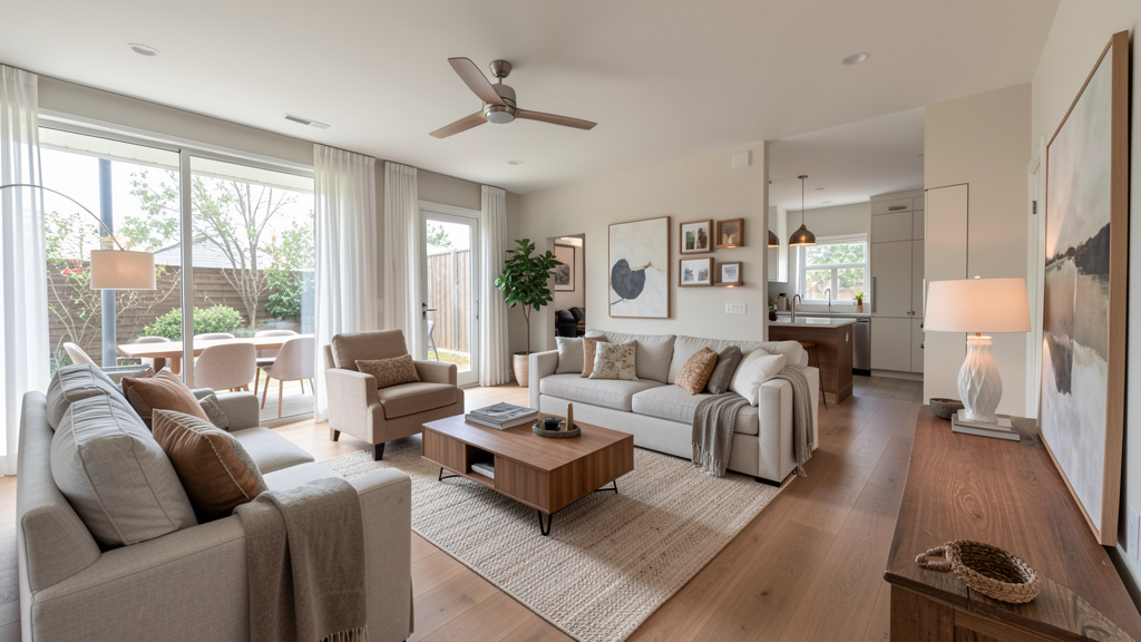
Illustrative example: A household renovating their 1920s Craftsman bungalow selected a palette of warm white (dominant), charcoal (secondary), forest green (accent), and unlacquered brass (metallic). In the living room, forest green appeared in velvet accent chairs; in the kitchen, as enamelware on open shelves; in the hallway, as the interior paint of the front door. Brass hardware unified cabinets, light fixtures, drawer pulls, and picture frames throughout. Visitors consistently remarked how “intentional” the home felt—each room had distinct character, yet the subtle repetitions created an undeniable sense of wholeness. The green wasn’t everywhere; it was strategically placed.
Pillar 2: Lighting Rhythm and Temperature
Lighting does far more than illuminate—it sets physiological and emotional tone. Incoherent lighting (cool-white LEDs in the kitchen visible from a warm-lit living room) can create subconscious dissonance. Establish a consistent lighting “rhythm” by unifying color temperature where spaces visually connect and layering light sources with purpose. This pillar is frequently overlooked yet profoundly impactful for perceived flow.
Why this works: The human circadian system responds to light temperature. Consistent warm light (2700K–3000K) throughout connected living areas supports a sense of relaxation and continuity. Abrupt shifts to cooler light (4000K+) in adjacent visible zones can feel jarring because they mimic midday sun—a cue for alertness—in spaces meant for unwinding. Lighting research supports that homes with uniform warm lighting in social zones often report higher satisfaction with spatial cohesion.
How to implement it:
1. Standardize color temperature in connected spaces. For all main living areas visible from one another (living room, dining room, kitchen, hallways), use bulbs rated 2700K to 3000K. This creates a warm, inviting glow that feels cohesive. Reserve cooler temperatures (3500K–4000K) strictly for task-specific zones not visible from primary living areas: enclosed home offices, garages, utility rooms, or workshop areas.
2. Layer light sources consistently. Every room benefits from three layers:
– Ambient: Overall illumination (ceiling fixtures, recessed lights, cove lighting).
– Task: Focused light for activities (desk lamps, under-cabinet lighting, reading lights).
– Accent: Highlights architectural features or art (track lighting, picture lights, wall sconces).
Maintain this triad across rooms. If your living room uses floor lamps (task) and wall sconces (accent), echo that layering in the bedroom with bedside lamps (task) and a picture light over the headboard (accent). Consistency in layering creates predictable visual comfort.
3. Repeat fixture styles or finishes thoughtfully. You don’t need identical fixtures, but using the same metal finish (e.g., matte black) or design motif (e.g., organic shapes, geometric forms) creates visual echoes. In an open-plan space, vary fixture sizes but keep the style family consistent—a large woven rattan pendant over the dining table, medium-sized rattan pendants over the kitchen island, and small rattan wall sconces in the hallway.
Common considerations:
– Challenge: Mixing bulb temperatures haphazardly. A cool-white kitchen visible from a warm-lit living room can feel like crossing into a different environment.
Approach: Replace bulbs in connected spaces to match. Smart bulbs offer flexibility (warmer in evening, slightly cooler in morning) but set a default temperature for cohesion. Always check bulbs while standing in the doorway between rooms—does the transition feel smooth?
– Challenge: Relying solely on overhead lighting. This can flatten space, create harsh shadows, and eliminate depth.
Approach: Add at least two additional light sources per room. An inexpensive plug-in wall sconce, a thrifted table lamp with a new shade in your core palette, or LED tape under shelves transforms flat lighting into dimensional ambiance.
Adaptable for constraints: Start with bulbs. Replacing mismatched bulbs with a consistent 2700K temperature is often the highest-impact, most accessible upgrade. For outdated fixtures, remove shades and refresh bases with high-heat matte finish paint (matte black, brass) for minimal cost. Thrift stores often have lamps with solid structure—simply swap shades for ones in your dominant neutral or accent color. Command hooks can mount lightweight plug-in sconces where hardwiring isn’t possible.
Illustrative example: A household in an open-concept condo felt their space was “choppy” and disjointed. The kitchen had harsher-toned lighting, the living room used aging warmer bulbs, and the dining area was dimly lit by a single fixture. They replaced all visible bulbs with 2700K LEDs, added matching black arc floor lamps in the living and dining zones, and installed warm under-cabinet lighting in the kitchen. They also placed a small table lamp on a console visible from the entryway. The result was transformative: a seamless, inviting glow that made the entire space feel larger, warmer, and intentionally connected. Evening gatherings felt more intimate because lighting no longer created visual barriers between zones.
Pillar 3: Scale and Proportion as Connective Tissue
Scale (size of objects relative to space) and proportion (relationship between object sizes) form the silent scaffolding of flow. Ignoring these principles is a common cause of disjointed spaces—oversized furniture crammed into a small room adjacent to a cavernous space with dainty decor feels chaotic. Establishing consistent scale awareness creates subconscious order and comfort. This pillar requires observation, not expense.
Why this works: Our brains seek visual balance. When furniture and decor are appropriately scaled to their rooms and to each other, spaces feel harmonious and intentional. Observed patterns in residential design indicate that homes with consistent scale principles are frequently perceived as more comfortable and inviting. This isn’t subjective preference alone; it relates to how we process spatial relationships.
How to implement it:
1. Define your home’s “scale signature.” Walk through design resources (curated books, museum archives) and note whether you’re consistently drawn to:
– Grand scale: Large furniture, dramatic art, high ceilings (common in modern farmhouses, traditional homes).
– Intimate scale: Cozy, human-sized furniture, clustered decor (common in cottages, bungalows, mid-century homes).
– Transitional scale: A mix, but with intentional anchors (e.g., one substantial statement piece per room).
Choose one signature and apply it consistently. If your living room features a deep sectional sofa, avoid placing delicate spindle-back chairs in the adjacent dining room—opt for chairs with substantial presence instead. Scale should feel intentional, not accidental.
2. Apply the “rule of thirds” for art and large decor. Artwork should occupy roughly two-thirds the width of the furniture below it. A tiny painting floating above a large sofa breaks scale; a thoughtfully sized gallery wall spanning the sofa’s width creates balance. Apply this consistently: art above your bed relates proportionally to the headboard; a mirror over your console table relates to the table’s width. This repetition creates visual rhythm room to room.
3. Create scale anchors in open plans. In large, open spaces, use area rugs to define functional zones. The rug under the living room seating should be large enough that all furniture legs (or at least front legs) sit on it. The dining room rug should extend sufficiently beyond the table to accommodate pulled-out chairs. Consistent rug sizing principles (e.g., all main rugs are appropriately scaled to their zones) prevent a “patchwork quilt” effect that fractures flow.
Common considerations:
– Challenge: Using identical rug sizes regardless of room dimensions. A small rug drowns in a large living room; the same rug overwhelms a small bedroom.
Approach: Scale rugs to the room. Measure first: for living rooms, leave 12–18 inches of bare floor between rug edge and walls. For bedrooms, ensure the rug extends 18–24 inches beyond the bed on all sides (or at least under the bottom two-thirds of the bed frame). When in doubt, a slightly larger rug is generally preferable—rugs that feel too small are a common scale challenge.
– Challenge: Ignoring vertical scale. Tall rooms with low-slung furniture feel unbalanced; low-ceilinged rooms with towering bookcases feel oppressive.
Approach: In tall rooms, use floor-to-ceiling curtains hung close to the ceiling, and choose art that spans significant vertical space. In low-ceilinged rooms, select low-profile furniture (platform beds, shallow sofas) and emphasize horizontal lines with long, low art or shelving to create perceived height.
Adaptable for constraints: Rearrange existing furniture before purchasing new. Sometimes moving a large bookcase from a cramped room to a spacious one solves scale issues instantly. Use accessible solutions: build a simple console table to scale for an empty wall using affordable materials and hairpin legs. Create large-scale art affordably by framing inexpensive fabric remnants, vintage maps, or wallpaper samples in identical frames pulled from your core metallic finish.
Illustrative example: In a loft space, the living area initially felt “floating” and disconnected within the vast footprint. The solution wasn’t buying larger furniture but adding intentional scale anchors: a generously sized wool rug under the seating group, floor-length linen curtains on the industrial windows, and a large abstract painting spanning two-thirds of the sofa’s width. In the adjacent dining area, they used a similarly scaled rug and a statement chandelier with proportions echoing the painting’s height. The loft transformed from feeling like separate furniture islands into intentionally zoned areas. Each space felt grounded, and the consistent scale choices created a visual bridge between zones.
The Fundamental Principle: Cohesion begins not with what you add, but with the invisible threads you weave—color relationships, lighting rhythm, and scale awareness form the silent architecture of flow. Master these, and every subsequent choice becomes more intuitive.
Layer 2: The Connection Layer – Mastering Transitions and Sightlines
With your Foundation Layer solidified, shift focus to the spaces between rooms. This layer addresses physical pathways (hallways, doorways) and visual pathways (what you see when looking from one room into another). These transition zones are where flow is won or lost. A beautifully styled living room loses its impact if the hallway leading to it is cluttered, dimly lit, and disconnected. The Connection Layer ensures that movement through your home feels intuitive, guided, and visually pleasing. Treat transitions not as afterthoughts, but as intentional chapters in your home’s story.
Strategy 1: Curating Sightlines Like a Cinematographer
A sightline is any unobstructed view from one point in your home to another. In open-plan homes, sightlines are abundant; in compartmentalized homes, they occur through doorways. Treat each significant sightline as a carefully composed frame. What does a visitor see when standing at the front door looking through to the backyard? What’s visible from the kitchen sink into the living room? These views should tell a cohesive, calming story—not reveal visual chaos.
Why this works: Our eyes are naturally drawn to vistas and openings. When sightlines are curated, they create anticipation, guide exploration, and reinforce unity. Uncurated sightlines (a cluttered desk visible from the dining table, items piled on a chair in the hallway) introduce visual noise that disrupts flow. Environmental design principles note that controlled sightlines can significantly reduce the perception of clutter—because the brain processes intentional composition more efficiently.
How to implement it:
1. Conduct a “sightline audit.” Walk slowly through your home. Stop at key vantage points:
– Front door entrance (looking inward)
– Center of the kitchen (looking toward living/dining areas)
– Head of the stairs (looking down)
– End of hallways (looking toward main rooms)
At each spot, take a mental photograph. What elements catch your eye first? Are they harmonious with adjacent rooms? Jot down notes: “From front door, see cluttered coat rack and mismatched art in hallway.” Be honest—this is diagnostic, not judgmental.
2. Apply the “three-element rule” to key vistas. In any important sightline (e.g., from living room into dining room), ensure you see no more than three distinct design elements that repeat your core palette. For example:
– Element 1: The warm white of the dining room walls (matches living room trim).
– Element 2: A charcoal area rug under the dining table (echoes the living room sofa).
– Element 3: A ceramic vase with dried eucalyptus on the console table (ties to living room accent pillows).
This creates a deliberate visual path without overwhelming the eye. Fewer than three elements can feel sparse; more than three can feel chaotic.
3. Use “visual buffers” for challenging sightlines. If an unavoidable sightline reveals a dissonant element (laundry room door from the hallway, a utilitarian closet interior), place a buffer: a tall floor plant (fiddle-leaf fig, snake plant), a narrow console table with a lamp in your core palette, or a piece of art that draws the eye away. The buffer should incorporate at least one element from your Foundation Layer (e.g., the lamp has a brass base matching your metallic accent).
Common considerations:
– Challenge: Ignoring “negative sightlines”—views of purely functional spaces (pantry interiors, closet contents, utility areas) that break the design narrative.
Approach: Install soft-close doors with consistent hardware finishes. Use decorative baskets for storage inside closets visible from hallways. Add a lightweight curtain across a pantry opening in a fabric that complements your core palette. For open shelving, style items by color family to create visual order.
– Challenge: Over-decorating sightlines. A vista crammed with too many objects, patterns, or colors feels chaotic.
Approach: Edit thoughtfully. Remove one item at a time until the view feels calm and intentional. Remember: negative space is a powerful design element. Allow walls and surfaces to breathe.
Adaptable for constraints: Rearrange existing furniture to improve sightlines. Move a bookcase to block an unsightly view, or angle a sofa to frame a pleasant vista (like a window with greenery). Use removable hooks to hang a lightweight tapestry, macramé wall hanging, or fabric panel in a doorway to soften a harsh transition. Thrift stores often have affordable mirrors—place one strategically to reflect a pleasant view (a plant, artwork) and redirect the eye away from problem areas.
Illustrative example: A homeowner had an open staircase where the view from the entryway straight up to the second-floor hallway felt stark and unfinished. They placed a narrow console table at the base of the stairs with a lamp (in their core brass finish) and a small tray holding keys and a single succulent. On the wall opposite the stairs, they hung a large mirror in a black frame (matching their secondary neutral) that reflected the front door’s warm wood tone and the entryway greenery. Now, the sightline from the door draws the eye to the mirror’s reflection, creating depth, warmth, and connection. The hallway upstairs feels like a natural extension of the entryway journey.
Strategy 2: Hallways and Doorways as Intentional Passages
Hallways and doorways are not merely functional corridors—they are opportunities to reinforce cohesion and set expectations. A neglected hallway feels like a tunnel; a thoughtfully designed one feels like a gallery. Doorways frame the transition between rooms; their treatment signals what lies beyond and prepares the visitor for the shift in function or mood.
Why this works: Transitional spaces psychologically prepare us for what’s next. A hallway with consistent lighting, art at eye level, and a runner rug that echoes the main living area’s colors creates anticipation and reduces the “surprise” factor of entering a stylistically different space. This makes transitions feel deliberate rather than disruptive, supporting a sense of calm continuity throughout the home.
How to implement it:
1. Treat hallways as mini-rooms. Apply your Foundation Layer principles here:
– Color: Paint hallway walls the same dominant neutral as adjacent rooms, or use a slightly deeper shade of the same color family for intimacy and depth.
– Lighting: Install wall sconces or recessed lights at consistent intervals (every 6–8 feet) with the same finish as other rooms. Avoid a single overhead light that creates harsh shadows. If hardwiring isn’t possible, use plug-in sconces with cord covers.
– Scale: Choose art and decor scaled to the hallway’s width. In a narrow hall, use vertical art or a single long floating shelf. In a wide hall, create a gallery wall with frames in your core metallic finish. Ensure art is hung at average eye level (57–60 inches from floor to center of frame).
2. Define doorway thresholds with intention. For doorways between rooms of different functions (e.g., formal dining to casual family room), use subtle cues:
– Flooring transition: If flooring changes (hardwood to tile), use a threshold strip in a finish that bridges both materials (e.g., brushed nickel for light wood to light tile).
– Architectural detail: Paint the interior of the doorway frame (the “reveals”) in your accent color. This creates a subtle “picture frame” effect that highlights the transition without severing connection. It’s a whisper of color that guides the eye forward.
– Textural cue: Place a small rug just inside the doorway of the new room in a pattern that incorporates the next room’s accent color, signaling the shift ahead while maintaining a thread of continuity.
Common considerations:
– Challenge: Leaving hallways bare except for a light switch and perhaps a coat hook. This wastes a prime opportunity for cohesion.
Approach: Add at least one unifying element: a runner rug in a neutral tone with subtle texture (sisal, jute), a single impactful piece of art at the end of the hall to draw the eye forward, or a narrow console table with a plant and a small lamp.
– Challenge: Using drastically different flooring materials without transition planning. A sudden shift from dark wood to bright white tile can feel like crossing a visual fault line.
Approach: If replacing flooring isn’t feasible, use area rugs to bridge the gap. Place a rug that overlaps both materials slightly, with colors pulled from both rooms. Alternatively, position furniture (a console table, a bench) over the transition seam to minimize its visual impact.
Adaptable for constraints: Paint is a powerful ally. Painting a hallway the same color as the living room instantly connects them visually. For doorways, removable wallpaper samples or washi tape in your accent color on the interior frame creates a custom look without commitment. Thrift stores often have narrow rugs perfect for hallways—look for neutral tones with texture (jute, sisal, flatweave) that won’t clash with any room. Command strips can hang lightweight art securely.
Illustrative example: In a historic home with a long, narrow, and previously dark hallway connecting the parlor floor to the kitchen, the space felt like a “dead zone” that disrupted flow. They painted the walls a light warm white (matching the parlor), installed three matching black wall sconces for consistent, shadow-free lighting, and laid a durable sisal runner rug. On the walls, they hung a series of black-and-white family photos in identical black frames (echoing the sconce finish and secondary neutral). At the end of the hall, a large mirror reflected light from the kitchen window, making the hallway feel expansive and intentional. The space transformed into a curated gallery that celebrated the journey between spaces.
Strategy 3: Flooring Flow and Material Transitions
Flooring is the literal ground plane of your home. Inconsistent materials, colors, or installation directions can fracture flow dramatically. While matching flooring throughout is ideal, it’s often impractical due to budget, structural constraints, or existing conditions. The goal is to create intentional transitions that feel purposeful and considered, not accidental or neglected.
Why this works: Flooring guides physical movement and visual flow. When materials change logically (durable tile in entryways, warm wood in living areas), it supports function while maintaining visual continuity through color relationships, pattern echoes, or strategic buffering. Our brains seek continuity underfoot; abrupt, unplanned changes can trigger subtle disorientation.
How to implement it:
1. Create a flooring map. Sketch a simple floor plan and note existing materials. Identify all transition points between rooms. Aim for no more than three primary flooring types on any single level (e.g., hardwood in living/dining, tile in kitchen/entry, low-pile rug in bedroom zones). If you have more, use area rugs strategically to visually unify adjacent zones.
2. Bridge materials with color and pattern. If your kitchen has light oak floors and the living room has medium walnut, choose an area rug for the living room with both light and medium brown tones woven throughout. This creates a gradient effect that softens the transition. For patterned tiles (e.g., hexagon in a bathroom), select a bath mat or small rug with a similar geometric motif in neutral colors to echo the pattern without demanding exact matching.
3. Align flooring direction where possible. In open-plan spaces, lay wood flooring planks in the same direction throughout. If rooms are separated by walls but visible through doorways, align the plank direction with the primary sightline (e.g., run planks parallel to the longest wall visible from the entryway). This guides the eye smoothly through the space, enhancing perceived continuity.
Common considerations:
– Challenge: Using high-contrast transitions without buffer zones. A black tile entryway flowing directly into light wood floors can feel like a visual stop sign.
Approach: Place a large neutral rug in the transition zone (e.g., just inside the living room doorway) that incorporates both dark and light tones. Alternatively, use a threshold strip specifically designed for the material change, in a finish that complements both surfaces (e.g., oil-rubbed bronze for dark wood to dark tile).
– Challenge: Ignoring grout lines, seams, or misaligned patterns at transitions. These details can scream “unfinished” and disrupt flow.
Approach: If renovating, plan transitions to occur at natural breaks like doorways. Use appropriate transition strips (T-molding, reducer strips) designed for the specific materials. For existing homes, strategic furniture placement (a console table, a bench) can minimize the visibility of problematic seams.
Adaptable for constraints: Area rugs are the ultimate flooring unifier. A large jute, sisal, or low-pile neutral rug in a living area can cover mismatched flooring and tie it visually to adjacent spaces. For renters or temporary fixes, high-quality peel-and-stick tiles or vinyl planks in a consistent neutral tone can update an eyesore section of flooring (like a dated bathroom or kitchen) without permanence. Always test samples in the actual space under natural and artificial light before committing.
Illustrative example: A household had a ranch-style home with three different flooring types on the main level: orange-toned oak in the living room, beige ceramic tile in the kitchen, and dark brown vinyl in the central hallway. A full replacement was financially impossible. Their solution: They placed a large, textured neutral rug (with subtle gray and beige threads) over the living room oak, extending slightly into the hallway. In the kitchen, they added a durable runner rug in a similar neutral tone with a subtle geometric pattern that echoed the tile shape. The rugs created a cohesive “ground plane” that minimized the jarring transitions between materials. They also painted all baseboards throughout the main level the same crisp white, which further unified the spaces visually by creating a continuous horizontal line. The result was a home that felt intentionally designed.
Layer 3: The Personality Layer – Expressing Individuality Within the Framework
Now that unity and connection are firmly established, it’s time for the joyful part: letting each room’s unique purpose and personality shine. The Personality Layer ensures that cohesion doesn’t mean monotony or sterility. A child’s vibrant playroom should feel distinct from a serene master bedroom—but both can exist harmoniously within your home’s overarching style. This layer is about strategic variation: where to diverge, how much, and why. It’s the difference between a home that feels “designed” and one that feels “lived-in and loved.”
Technique 1: Room-Specific Accent Palettes
Your core Foundation Layer palette (3–5 colors) remains the backbone of cohesion. For each room, introduce one room-specific accent color that complements but doesn’t clash with the core palette. This color appears primarily or exclusively in that room (or its en suite), creating a sense of discovery, tailored function, and emotional resonance.
Why this works: Color psychology is well-documented. Specific hues influence mood and behavior: calming blues and greens support rest in bedrooms; energizing corals and yellows can boost creativity in home offices; warm terracottas and olives foster connection in dining areas. By containing these functional colors to specific rooms, you honor each space’s purpose without disrupting the home’s overall harmony. The core palette acts as a stabilizing buffer, ensuring the room-specific color feels intentional rather than random.
How to implement it:
1. Assign accent colors based on room function and desired emotional impact:
– Bedrooms: Calming, restorative hues (soft sky blue, muted lavender, sage green, warm greige).
– Home offices/Studies: Stimulating but focused colors (coral for energy, deep teal for concentration, warm mustard for creativity—in small doses).
– Kitchens/Dining Areas: Appetite-enhancing or socially warm colors (terracotta, olive green, warm reds or rusts—use sparingly in accessories).
– Bathrooms: Spa-like, cleansing tones (sea glass green, pale aqua, warm stone gray, creamy white).
– Playrooms/Hobby Rooms: Energetic but balanced colors (mustard yellow, sky blue, coral—avoid neon or overly saturated tones that cause visual fatigue).
2. Limit the room-specific color to a modest portion of the room’s visual weight. Use it intentionally in:
– One larger anchor item (an accent chair, a shower curtain, a bench at the foot of the bed)
– Multiple smaller curated items (throw pillows, art prints, ceramic vases, plant pots)
– Architectural accents (painted interior of a bookshelf, a single accent wall, ceiling beams)
3. Anchor the room-specific color to the core palette. Ensure it shares an undertone with your core neutrals. For example, if your core neutrals are warm (beige, cream, warm white), choose a warm room-specific accent (terracotta, not cool mint green). Test physical paint swatches or fabric samples side-by-side in the room’s actual lighting at different times of day before committing.
Common considerations:
– Challenge: Using room-specific accents that clash with the core palette’s undertones. A cool-toned teal in a room with warm beige walls can look muddy or disconnected.
Approach: Use a physical color wheel. Choose accents adjacent to your core accent color (analogous scheme) or directly opposite (complementary) but in muted, desaturated tones. When in doubt, pull colors directly from a piece of art, textile, or object you already love for that room.
– Challenge: Overusing the room-specific accent. A bedroom saturated in bold purple can feel overwhelming and counterproductive to rest.
Approach: Adhere to a balanced ratio: the majority of the room reflects the core palette foundation, with the room-specific accent used as a “pop” or focal point. If the color feels too strong, scale back to smaller applications.
Adaptable for constraints: Introduce room-specific accents through easily changeable, accessible items: bedding sets, curtain panels, removable wallpaper on a single accent wall (check rental agreements first), or even painted thrifted furniture. A sample pot of paint on a small side table or the interior of a bookshelf can define a room’s personality without permanent commitment. Swap these elements seasonally or as tastes evolve.
Illustrative example: In an apartment, the open living and dining area shared the core palette of warm white walls, charcoal sofa and dining chairs, and brass lighting accents. The bedroom introduced a room-specific accent of dusty rose—a color chosen for its calming, nurturing qualities. This appeared in the velvet bench at the foot of the bed, a watercolor landscape painting above the headboard, and ceramic vases on the nightstands. Crucially, the dusty rose was selected for its warm undertones, which harmonized perfectly with the charcoal and brass elements carried over from the main living area. Guests consistently note how the bedroom feels like a serene, intentional retreat distinct from the social energy of the living areas, yet undeniably part of the same cohesive home.
Technique 2: Thematic Storytelling Through Collections and Art
Every room can tell a micro-story that contributes to your home’s macro-narrative. This isn’t about matching themes rigidly (nautical everywhere) but about curating collections or art that reflect the room’s purpose, your personal history, and interests—while adhering to unifying constraints that prevent visual chaos.
Why this works: Personal collections create emotional resonance and authenticity. When displayed with intention and constraints, they feel curated and meaningful rather than cluttered or random. Constraints (like consistent frame colors, grouping strategies, or display methods) ensure collections enhance cohesion rather than disrupt it. This technique transforms objects into narrative elements.
How to implement it:
1. Define a “display language” for your entire home. Choose one or two consistent methods for showcasing collections across all rooms:
– Frame uniformity: All art, photos, and prints use frames in your core metallic finish (e.g., black for modern/minimalist homes, unlacquered brass for traditional/warm homes) or a consistent natural material (e.g., light oak, rattan).
– Grouping strategy: Use grids (for modern homes), salon-style clusters (for traditional/eclectic homes), or linear arrangements (for minimalist homes). Apply the same strategy consistently.
– Shelving style: Open shelves in kitchens, living rooms, and offices use the same bracket style, wood tone, or finish. This creates visual rhythm even when contents vary.
2. Tailor collections to room function and story:
– Entryway: A curated collection of vintage mirrors, hats, or small sculptures that welcome guests and hint at your style.
– Living Room: Coffee table books stacked intentionally by color (pulling from your core palette) or a curated shelf of travel souvenirs displayed with purpose.
– Kitchen: Open shelving displaying dishware in your core accent color, or a wall of framed botanical prints related to cooking/herbs.
– Bedroom: A gallery wall of meaningful family photos in uniform frames, or a collection of inherited textiles (quilts, scarves) displayed as art on a wall or bed.
– Home Office: A collection of inspiring objects (vintage cameras, geological specimens, antique pens) that reflect your work or passions.
3. Edit with purpose and intention. Rotate collections seasonally or annually to keep spaces feeling fresh. Store items not on display in labeled, attractive bins. Remember: negative space around collections is crucial—they need room to breathe and be appreciated. Apply the “one in, one out” rule for new acquisitions.
Common considerations:
– Challenge: Letting collections sprawl haphazardly across multiple rooms. A random seashell on a bathroom shelf, another on a living room mantel, feels scattered and unintentional.
Approach: Confine thematic collections to one or two rooms where they make contextual sense. If you love seashells, display them prominently in a bathroom, sunroom, or coastal-themed guest room—not sporadically throughout the house. This creates intentional “chapters” in your home’s story.
– Challenge: Ignoring scale and proportion in collections. A tiny collection of small frames on a large blank wall looks lost; an overcrowded bookshelf feels chaotic.
Approach: For walls, follow the two-thirds rule: the collection should occupy roughly two-thirds of the available wall space. For shelves, leave 30–40% of the shelf surface empty for visual balance and breathing room. Step back frequently while arranging to assess the overall composition.
Adaptable for constraints: Start small and build intentionally. A single well-chosen piece of art or a thrifted frame can begin a collection. Group inexpensive items (vintage plates, postcards, fabric swatches) using uniform frames or mounting methods. DIY framing with mat boards in your core neutrals elevates humble items. Visit flea markets, estate sales, or online marketplaces for unique, affordable pieces that tell a story. Remember: meaning matters more than monetary value.
Illustrative example: A teacher filled her dedicated home office with a carefully curated collection of antique globes, vintage maps, and geography textbooks—a nod to her lifelong passion. All frames were black (matching her core secondary neutral), and maps were grouped in a precise grid above her desk. In the adjacent living room, she displayed a completely different collection: handmade pottery from local artisans collected over decades. The pottery was arranged on a single floating shelf, with pieces intentionally chosen in her core accent color (forest green) and neutral earth tones. The collections felt deeply personal and perfectly suited to each room’s purpose, yet the consistent black frames, intentional grouping, and adherence to the core palette ensured they enhanced rather than disrupted the home’s overall cohesion.
Technique 3: Texture and Pattern as Controlled Variables
Texture and pattern add essential depth, tactility, and sensory interest to a home. In the Personality Layer, you can vary these elements room by room to support function, mood, and seasonal changes, while keeping the Foundation Layer’s color and scale consistent. A plush shag rug in the bedroom invites coziness; crisp linen curtains in the dining room feel fresh and formal; woven seagrass baskets in the entryway signal organization.
Why this works: Texture engages multiple senses—even visually, it creates perceived tactility that makes spaces feel layered, lived-in, and authentic. Pattern directs visual energy: large-scale, bold patterns stimulate and energize; small-scale, subtle patterns soothe and calm. By controlling where and how you use texture and pattern, you create intentional emotional journeys through your home without relying solely on color.
How to implement it:
1. Assign texture profiles by room function and desired sensory experience:
– High-traffic areas (entryway, kitchen, hallways): Durable, easy-to-clean, low-maintenance textures (flatweave rugs, leather or performance fabric upholstery, wipeable surfaces, smooth ceramics).
– Relaxation zones (bedroom, living room seating area): Soft, inviting, comforting textures (plush area rugs, velvet or bouclé upholstery, chunky knit throws, faux fur pillows, nubby wool blankets).
– Workspaces (home office, craft room, study): Stimulating, tactile textures that invite interaction (woven baskets for storage, raw wood desks, textured ceramic desk accessories, cork boards).
– Bathrooms: Spa-like, soothing textures (plush bath mats, soft towels, smooth stone or ceramic surfaces, woven shower baskets).
2. Pattern strategy for cohesion and interest:
– Use large-scale patterns in spacious rooms to avoid feeling busy or overwhelming (e.g., a bold floral on dining chairs in a large dining room, a large geometric rug in an open living area).
– Use small-scale patterns in compact rooms to add visual interest without overwhelming the space (e.g., a subtle stripe on bedroom curtains, a tiny polka dot on a powder room shower curtain).
– Mix patterns within a single room using your core palette as the unifying thread: include one large-scale pattern, one medium-scale pattern, and one small-scale pattern, all sharing at least one color from your core palette. This creates dynamic interest while maintaining harmony.
3. Create intentional texture transitions between rooms. In open-plan spaces, use texture variation to define functional zones without physical barriers. For example:
– Living area zone: Plush shag or high-pile area rug, velvet sofa, nubby knit throw.
– Dining area zone: Smooth wood table surface, woven rush or cane chairs, flatweave rug under the table.
The change in texture signals a shift in function and mood while the consistent color palette and scale anchors maintain visual flow.
Common considerations:
– Challenge: Using the same heavy, high-pile texture everywhere (e.g., shag rugs in every room). This flattens the sensory experience and can make spaces feel visually heavy or monotonous.
Approach: Vary textures intentionally room by room. If the living room features a plush shag rug, choose a flatweave, low-pile, or textured neutral rug (like jute or sisal) for the adjacent dining area. This creates sensory distinction while maintaining color continuity.
– Challenge: Clashing patterns with no unifying color thread. A geometric print pillow placed on a floral sofa with no shared colors feels chaotic and unresolved.
Approach: Always pull at least one color from the larger pattern (e.g., the dominant color in the floral sofa fabric) and use it in the smaller pattern (e.g., the geometric pillow). This creates a visual bridge. When mixing patterns, vary the scale significantly (large floral + small stripe + tiny dot) to avoid visual competition.
Adaptable for constraints: Swap textiles seasonally to refresh texture and pattern affordably. Store heavy wool blankets and velvet pillows in summer; bring out light cotton throws and linen pillow covers in winter. Use removable fabric covers on pillows and slipcovers on chairs to change patterns without buying new furniture. Thrift stores, estate sales, and online marketplaces are excellent sources for unique textured items like baskets, trays, vintage linens, and ceramic pieces. DIY projects like dip-dyeing pillow covers or stenciling patterns onto plain fabric allow for personalized pattern creation within your core palette.
Illustrative example: In a coastal home with an open living-dining-kitchen area, the living room zone featured a nubby bouclé sofa (texture for relaxation and comfort) and large-scale ikat pattern throw pillows in the core accent color of navy blue. The adjacent kitchen zone had smooth matte-finish cabinets, durable quartz countertops (practical texture), and simple subway tile backsplash (subtle pattern). The dining nook bridged the two zones with woven cane-back dining chairs (textural interest and breathability) and solid-colored upholstered seats in the core secondary neutral (charcoal). The variation in texture and pattern supported each zone’s distinct function—relaxation, preparation, and gathering—while the consistent navy, charcoal, and warm white color story ensured seamless visual flow. Guests naturally gravitate to different zones based on the sensory cues, yet the space feels unified and intentional.
Adapting the Framework to Real-World Scenarios
No two homes share identical challenges. The true power of the Style Continuum Framework lies in its adaptability. Below, we address five common architectural and lifestyle scenarios. Each scenario includes tailored applications of all three framework layers, accessible solutions, and practical tips refined through observed patterns. These are grounded strategies for the homes people actually live in.
Scenario 1: The Open-Concept Living Area (Kitchen, Dining, Living Room Combined)
Challenge: Creating distinct functional zones without walls, avoiding a “warehouse” effect where everything blends into visual chaos or feels disconnected.
Framework Application:
– Foundation Layer: Use a single dominant neutral for all walls, ceilings, and major surfaces (e.g., warm white paint throughout). Choose one secondary neutral for large furniture pieces visible across zones (e.g., charcoal sofa, dining chairs with charcoal upholstery). Repeat your accent color and metallic finish strategically in all three zones—but vary the application (e.g., accent color in kitchen dishware on open shelves, living room throw pillows, dining room centerpiece vase; metallic finish on kitchen faucet, living room floor lamp, dining room light fixture).
– Connection Layer:
– Sightlines: From any primary seating position, ensure you see at least two elements from another zone that echo your core palette (e.g., from the living room sofa, see the charcoal dining chairs and a brass pendant light over the kitchen island). This creates visual threads.
– Flooring: If flooring is consistent, use area rugs to define each functional zone. Choose rugs with similar base colors or textures but varying patterns (e.g., a subtle geometric pattern in the living area zone, a solid neutral tone in the dining area zone). Ensure all rugs are large enough to anchor their zones properly.
– Lighting: Install a statement fixture over the dining table, matching pendants over the kitchen island, and floor lamps or wall sconces in the living area—all in the same metallic finish. Use dimmer switches on all zones to adjust ambiance while maintaining consistent color temperature (2700K–3000K).
– Personality Layer:
– Kitchen Zone: Introduce a room-specific accent in small, functional items (terracotta-colored ceramic canisters, a runner rug with warm rust tones). Prioritize durable, easy-clean textures (matte finishes, wipeable fabrics, smooth surfaces).
– Dining Zone: Choose a table with substantial scale to anchor the zone visually. Art above the sideboard can feature a room-specific theme (e.g., botanical prints) but must be framed in your core metallic finish.
– Living Zone: Prioritize soft, inviting textures (plush area rug, velvet or bouclé pillows) and calming patterns. A room-specific accent color here could be a soothing sage green in a chunky knit throw or a single armchair.
Practical Tip: Use furniture arrangement and strategic objects to create “invisible walls.” Angle a sofa away from the dining area to define the living zone. Place a console table behind the sofa with a lamp and a tall plant to delineate space without blocking sightlines. Large floor plants also soften transitions between zones and add life. Ensure pathways between zones remain clear and intuitive—flow should feel natural, not obstructed.
Scenario 2: The Compartmentalized Home (Traditional Layout with Defined Rooms and Hallways)
Challenge: Preventing rooms from feeling like disconnected, isolated boxes—especially when doorways are narrow, hallways are long, or room functions vary dramatically.
Framework Application:
– Foundation Layer: Paint all trim, interior doors, and baseboards the same crisp white (or your dominant neutral) throughout the entire main level. This creates a continuous “frame” that visually ties rooms together even when wall colors vary slightly. Use the same lighting fixture finish (e.g., matte black) on all visible fixtures—sconces in hallways, pendants in dining room, lamps in living room.
– Connection Layer:
– Hallways: Treat as intentional galleries. Install consistent wall sconces or recessed lighting spaced evenly. Hang art at precise eye level (57–60 inches to center) in frames matching your core metallic finish. Lay a durable runner rug in a neutral texture (sisal, flatweave jute) that visually connects the hallway to adjacent rooms. Place a narrow console table at the hallway’s end with a small lamp and a single decorative object in your accent color.
– Doorways: Paint the interior of each doorway frame (the “reveals”) in your core accent color. This creates a subtle, sophisticated “reveal” when moving between rooms—a whisper of color that signals transition while maintaining a thread of continuity.
– Sightlines: When a door is open, curate the view into the next room. Place a piece of furniture or art in the adjacent room that incorporates your core palette, visible through the doorway (e.g., a console table with a lamp in your metallic finish visible from the hallway into the living room).
– Personality Layer:
– Allow wall colors to vary slightly room to room (e.g., living room: warm beige; study: deeper taupe) but ensure they share the same undertone family (all warm or all cool). Introduce room-specific accent colors more boldly in these enclosed spaces since they’re less visible from other areas—this is where personality can shine.
– Use door style or hardware to hint at room personality: a paneled door for a formal dining room, a barn-style sliding door for a casual family room—but paint all doors the same color and use consistent hardware finishes for cohesion.
Practical Tip: Create “echo pairs” throughout the home. If the living room has a blue ceramic vase on the mantel, place a smaller blue object (a bookend, a small bowl, a framed print with blue tones) on the console table in the hallway. These subtle visual echoes guide the eye and mind through the home, creating a sense of intentional connection between seemingly separate spaces.
Scenario 3: The Multi-Story Home (Flow Between Floors)
Challenge: Ensuring the style journey continues seamlessly upstairs and downstairs without feeling like separate apartments or disconnected levels. Staircases often feel like neglected transition zones.
Framework Application:
– Foundation Layer: Extend your core palette visibly to all floors. The dominant neutral used on main floor walls should reappear on the second-floor hallway walls or in primary bedrooms. Repeat your metallic finish on light fixtures, hardware, and decor on every level—this is critical for vertical cohesion.
– Connection Layer:
– Staircase: This is your primary vertical sightline and transition zone. Paint the stair risers (vertical faces) in your core accent color for a dramatic, intentional thread that draws the eye upward. Install matching wall sconces on the wall alongside the stairs at consistent intervals. Hang a series of identical-framed photos, art prints, or a curated collection ascending the wall to create rhythm and guide movement.
– Hallways on each floor: Treat second-floor hallways with the same care as main-floor hallways—consistent lighting, art hung at eye level in uniform frames, and a runner rug if space allows. This reinforces that the entire home is a unified entity.
– Balconies/Loft Overlooks: If an upper floor overlooks the main living area below, ensure the railing finish, flooring material (if visible), and any furniture or decor echo the main floor’s palette. A small area rug on the overlook area should complement the rug visible below in color or texture.
– Personality Layer:
– Main Floor (Public Zones): Focus on social, welcoming personality—art collections that spark conversation, entertaining-focused accents, durable textures for high traffic.
– Upper Floor (Private Zones): Emphasize restful, personal personality. Bedrooms can feature stronger room-specific accent colors (calming blues, soft greens) and softer, more intimate textures (plush rugs, layered bedding). Bathrooms can incorporate spa-like elements (natural stone textures, serene colors) while still including subtle touches of the core palette (towels in accent color, hardware in core metallic).
Practical Tip: Carry one “hero” element vertically through the home. If your living room features a striking black-framed mirror above the mantel, place a smaller version of the same style mirror at the top of the stairs or in the upstairs hallway. This creates a powerful visual anchor that consciously connects the floors. Similarly, repeat a specific plant variety on multiple levels—living elements create organic continuity.
Scenario 4: Rental Properties and Temporary Spaces
Challenge: Achieving meaningful cohesion and personal expression without permanent changes (painting walls, replacing flooring, altering fixtures), often under strict lease restrictions.
Framework Application:
– Foundation Layer:
– Color: Use large textiles and strategic art to establish your palette. A large area rug in your dominant neutral can anchor a room visually. Floor-length curtains in a secondary neutral soften windows, add height, and unify wall colors. Large-scale art or framed fabric panels in your accent color tie spaces together.
– Lighting: Replace all visible bulbs with consistent 2700K–3000K LEDs immediately—this is almost always permitted and has massive impact. Use plug-in wall sconces (with cord covers), floor lamps, and table lamps with shades in your core palette. Lamp bases can introduce your metallic finish affordably.
– Scale: Rearrange existing landlord-provided furniture to improve scale relationships and sightlines. If furniture is mismatched, use throws, pillow covers, and slipcovers in your core palette colors to create visual unity.
– Connection Layer:
– Sightlines: Use room dividers (freestanding screens, open bookshelves) to block unsightly views or define zones. Place a console table behind the sofa with a lamp and decor in your palette to create a curated sightline from the entryway.
– Transitions: Use area rugs strategically to define zones and bridge flooring changes. A runner rug in the hallway ties it visually to adjacent rooms. Place small rugs just inside doorways of key rooms to signal transition.
– Doorways: Hang removable wallpaper samples, washi tape designs, or fabric swatches in your accent color on the interior of doorway frames (test adhesion first in inconspicuous spot). Use over-door organizers in neutral colors that complement your palette for functional cohesion.
– Personality Layer:
– Focus exclusively on removable, portable elements: peel-and-stick wallpaper on a single accent wall (check lease first and test removal), removable hooks for art, command strips for floating shelves. Choose decor that can move with you—framed art, textiles, plants, baskets.
– Create “renter-friendly anchors”: a distinctive floor lamp that moves room to room, a collection of matching storage baskets that appear in multiple spaces (entryway, living room, bedroom), a signature throw blanket draped consistently on seating.
Practical Tip: Document your changes thoroughly with photos before moving in and after implementing changes. This builds trust with landlords and ensures easy, damage-free reversion when moving out. Frame changes as enhancements: “I added warm lighting to make the space feel more welcoming” or “I used rugs to protect the flooring.” Focus on solutions that improve the space’s functionality and appeal without alteration.
Scenario 5: Small Spaces and Apartments (Studios, One-Bedroom Units)
Challenge: Making a compact footprint feel intentional, spacious, and functional—not cramped, cluttered, or chaotic. Every square inch must earn its place.
Framework Application:
– Foundation Layer:
– Color: Use light, reflective dominant neutrals (warm whites, light greiges, soft beiges) on walls and large furniture to maximize light reflection and perceived space. Avoid dark colors except as tiny, intentional accents.
– Lighting: Layer light sources meticulously to eliminate shadows and create depth. Use wall-mounted fixtures (sconces, swing-arm lamps) to save precious floor and surface space. Place mirrors strategically opposite windows or light sources to amplify natural light and create illusion of depth.
– Scale: Choose furniture with exposed legs (sofas, chairs, beds) to maintain sightlines underneath and create a feeling of airiness. Prioritize multi-functional pieces (storage ottomans that serve as seating and storage, nesting tables, Murphy beds) that don’t overwhelm the space visually or physically.
– Connection Layer:
– Sightlines: Keep primary pathways completely clear. Arrange furniture to create diagonal sightlines where possible—they make spaces feel larger than straight-on views. Use a single large mirror placed to reflect the room’s best feature (a window, a piece of art) to double the visual space.
– Transitions: In studio apartments, use a room divider thoughtfully: an open bookshelf (styled with books and objects in your core palette), a curtain on a tension rod (fabric in your accent color), or a tall plant screen. The divider should incorporate your core palette to maintain visual connection.
– Flooring: If possible, use one continuous flooring material throughout. If not, a single large area rug that spans the main living and sleeping areas (if feasible) unifies the ground plane visually. Avoid multiple small rugs that chop up the space.
– Personality Layer:
– Edit ruthlessly. Apply the “one in, one out” rule strictly. Every item must serve a purpose or bring significant joy. Use vertical space efficiently: floating shelves, tall narrow bookcases, over-door storage.
– Introduce room-specific accents through textiles that can be swapped easily (bedding, throw blankets, pillow covers). A single bold piece of art can define a zone without taking physical space. Use color intentionally in small doses to create “zones” visually (e.g., a blue throw on the sofa signals living area; blue bedding signals sleeping area).
Practical Tip: “Float” furniture away from walls where possible. Pulling a sofa or bed 2–3 inches from the wall creates shadow lines that add depth and make the room feel larger. Use furniture with casters for easy reconfiguration as needs change. In very small spaces, cohesion is even more critical—clutter and disconnection feel amplified. A tightly edited, intentional palette creates calm where chaos could easily reign.
Troubleshooting Common Flow Challenges (and Practical Solutions)
Even with a solid framework, specific challenges arise. Below are five frequent flow challenges homeowners encounter, with precise, actionable solutions rooted in the Style Continuum Framework. These address the urgent, problem-solving needs identified in common inquiries—readers seeking fixes, not just theory.
Challenge 1: “My Open-Plan Kitchen Feels Visually Disconnected from the Bright Living Room”
Diagnosis: Dramatic contrast in lighting temperature or intensity between zones—often cooler-toned kitchen lighting visible from a warmer-lit living area—creates a jarring visual disconnect. This is one of the most common flow disruptors.
Solution:
1. Immediate bulb replacement: Replace all kitchen bulbs (overhead, under-cabinet, pendant) with 2700K–3000K LEDs. This single change harmonizes light temperature. If under-cabinet lighting is cooler-toned, replace those strips too—many affordable peel-and-stick LED tapes now offer warm color temperatures.
2. Layer lighting strategically: Add warm task lighting in the kitchen—a plug-in pendant over the sink, or a small swing-arm wall lamp near the prep area. In the living room, add a floor lamp near the kitchen doorway to balance light levels and create a visual bridge.
3. Install a visual buffer: Place a tall, healthy floor plant (fiddle-leaf fig, bird of paradise) or a narrow open shelving unit between the zones. Style the shelves with items in your core palette (books with spines sorted by neutral tones, a ceramic vase in your accent color) to draw the eye and soften the transition.
4. Long-term consideration: Install dimmer switches on all kitchen and living room lights. Set the default evening ambiance to a warm, medium brightness that matches across zones. Smart bulbs allow scheduling—warmer tones in evening, slightly brighter (but still warm) in morning.
Why it works: Consistent light temperature eliminates the subconscious “alarm” of a temperature shift. Layering reduces harsh shadows and creates dimensional warmth. The buffer redirects focus to cohesive elements, making the transition feel intentional rather than accidental.
Challenge 2: “The Hallway to My Bedroom is a Dark, Uninviting Tunnel”
Diagnosis: Poor lighting, lack of visual interest, monochromatic walls, and disconnect from adjacent rooms make hallways feel like neglected afterthoughts rather than intentional passages.
Solution:
1. Lighting overhaul: Install at least two light sources. If hardwiring isn’t possible, use plug-in wall sconces (available with discreet cord covers) spaced evenly along the hall. Choose fixtures in your core metallic finish. Add a small table lamp on a narrow console table at the hallway’s end to draw the eye forward.
2. Amplify light and color: Paint the hallway walls a light shade of your dominant neutral (if permitted). If not, hang a large mirror at the end of the hall to reflect light from the adjacent room. Frame the mirror in your core secondary neutral or metallic finish. Apply removable wallpaper with a subtle reflective element (metallic ink, light pattern) on one accent wall if allowed.
3. Add curated elements: Hang art at precise eye level (57–60 inches to center) in frames matching your core palette. Lay a durable runner rug in a light, textured neutral (sisal, light jute) to add warmth underfoot and guide movement. Place a narrow console table with a small plant (real or high-quality faux) and a single decorative object in your accent color.
4. Curate the endpoint sightline: Ensure the view from the hallway into the bedroom features at least one element from your core palette (e.g., bedding in your dominant neutral, a piece of art with your accent color visible on the wall). This creates anticipation and connection.
Why it works: Layered lighting eliminates shadows and creates safety and warmth. Reflective surfaces amplify available light. Curated elements transform the hallway from a passage into a purposeful transition that prepares you for the next space.
Challenge 3: “My Rental Has Mismatched Wood-Toned Floors and Trim”
Diagnosis: Competing wood tones with different undertones create visual chaos and make the space feel dated and disjointed—a very common rental challenge.
Solution:
1. Unify with strategic rugs: Place large area rugs in key rooms (living room, bedroom) that cover most of the visible floor. Choose rugs with a neutral base (cream, light gray, warm beige) and subtle texture or pattern that incorporates both wood tones (e.g., a rug with light and medium brown threads woven throughout). In hallways, use a durable runner rug in a consistent neutral tone.
2. Address the trim visually: If painting isn’t allowed, use removable wallpaper samples or contact paper on the trim in a crisp white or your dominant neutral (test adhesion and removal first in an inconspicuous area). Alternatively, draw attention away from the trim by adding crown molding decals (peel-and-stick) in a matching finish, or by hanging art slightly lower to minimize focus on trim lines.
3. Create strong focal points upward: Use furniture and decor to shift visual focus upward. Hang art at eye level, install floating shelves with items styled in your core palette (books, small plants, ceramics), and use floor lamps to highlight these areas. The eye will follow the curated elements, not the floors or trim.
4. Strategic furniture placement: Position large furniture pieces (sofas, beds, bookcases) to cover the most problematic floor areas. Use area rugs under furniture groupings to define zones and minimize visible floor expanse. Choose furniture with legs to maintain some sightline to the floor, preventing a “floating box” effect.
Why it works: Rugs visually “reset” the floor plane and create a new, unified ground layer. Redirecting visual focus upward leverages the Foundation Layer’s color and scale principles to override flooring distractions. This solution works within rental constraints while creating immediate visual improvement.
Challenge 4: “I Inherited Dark Wood Furniture, but My Style is Light and Airy”
Diagnosis: Scale and color dissonance between inherited pieces (often heavy, dark-stained wood) and a desired light, modern aesthetic creates visual weight and disconnect.
Solution:
1. Assess for integration potential: Not all dark wood needs to go. Identify pieces with good structural lines, solid construction, or deep sentimental value. Many solid wood pieces can be refreshed with paint in a light neutral (chalk paint or mineral paint works well for adhesion) to match your dominant neutral. Update hardware with pulls or knobs in your core metallic finish for instant modernization.
2. Strategic placement for balance: Place dark wood pieces in rooms where they complement the palette and function. A dark wood dining table can anchor a light, airy dining room if balanced with light-colored chairs (reupholstered in your secondary neutral fabric) and a rug with dark threads that echo the table. Avoid placing multiple dark pieces in one room—distribute them thoughtfully.
3. Balance with light elements: Surround dark furniture with light walls, ample layered lighting, and light-colored textiles. A dark wood bed frame feels grounded and intentional when paired with white or light gray bedding, a light neutral area rug, and sheer curtains that filter light softly.
4. Edit and curate with intention: If a piece doesn’t work anywhere in your current layout, consider selling, donating, or storing it for a future home where it might fit. Keep only what serves your cohesive vision. For sentimental small items (a jewelry box, a picture frame), display them prominently in a curated vignette with other items in your palette—give them honor without letting them dominate.
Why it works: Refreshing or strategic placement transforms inherited pieces into intentional elements within your framework. Balancing dark with light prevents visual heaviness. Editing ensures only harmonious items remain. This solution honors legacy while creating a home that feels authentically yours today.
Challenge 5: “Every Room Feels the Same—Boring, Generic, and Soulless”
Diagnosis: Over-application of the Foundation Layer without meaningful Personality Layer variation. This is the flip side of disjointed rooms—a home that feels like a sterile showroom rather than a lived-in sanctuary.
Solution:
1. Conduct a personality audit: Room by room, ask: “Does this space reflect its specific function and the people who use it?” If not, introduce intentional room-specific accents. Add a bold piece of art that inspires you in the home office. Create a cozy reading nook with a unique accent chair in the bedroom. Display colorful dishware or open shelving with cookbooks in the kitchen.
2. Vary textures intentionally: Swap out identical throw pillows for room-specific textures—a nubby bouclé knit in the living room, smooth velvet in the bedroom, crisp linen in the dining room. Change rug textures per room (plush shag in living areas for comfort, flatweave or low-pile in dining areas for practicality).
3. Incorporate meaningful collections: Display items that tell your story. A gallery wall of travel photos in the hallway. A shelf of cookbooks and vintage utensils in the kitchen. A collection of plants in the sunroom. Ensure displays follow your established “display language” (uniform frames, intentional grouping) so they feel curated, not cluttered.
4. Adjust lighting ambiance per room: Use dimmers to create room-specific moods. A brighter, energizing light level in the kitchen for morning routines; a softer, warmer glow in the bedroom for evening wind-down. Add unique fixtures that reflect room personality—a sculptural ceramic lamp in the study, a delicate glass chandelier in the dining room—while maintaining your core metallic finish for cohesion.
Why it works: Intentional variation within the framework adds depth, meaning, and emotional resonance. Personal elements transform a “styled” home into a “lived-in” home that reflects your journey. Cohesion and personality are not opposites—they are partners.
Your Questions, Answered
Homeowners consistently seek clarity on nuanced aspects of creating flow. Below are ten thoughtful questions distilled from common inquiries. Each answer provides precise, actionable guidance grounded in the Style Continuum Framework—no fluff, no jargon, just practical wisdom.
Q: How do I create flow in a home with very little natural light?
A: Prioritize light-reflective surfaces and strategic artificial lighting. Paint walls, trim, and ceilings in the same light, warm neutral (e.g., a creamy white). Use mirrors opposite any available light source to amplify brightness. Layer lighting meticulously: ambient (recessed or ceiling fixtures), task (under-cabinet, desk lamps), and accent (wall sconces, picture lights)—all in 2700K–3000K bulbs. Choose furniture with light finishes and reflective surfaces (glass, lacquer) to bounce light. Avoid heavy, light-absorbing textiles; opt for lighter weaves and sheens. In hallways or dark corners, add plug-in sconces or small lamps to eliminate shadowy zones. Remember: consistent warm lighting temperature is more critical than brightness alone for perceived cohesion.
Q: Can I mix different design styles (e.g., modern and traditional) and still have flow?
A: Absolutely—and many enduring homes do this successfully. The key is using your Foundation Layer as the unifying anchor. Choose a consistent color palette, lighting temperature, and scale signature that bridges both styles. For example, pair a traditional carved wood dining table (dark wood) with modern upholstered chairs in your core secondary neutral. Use the same metallic finish on light fixtures throughout (e.g., matte black on a contemporary floor lamp in the living room and on traditional sconces in the hallway). Let the Connection Layer smooth transitions: a hallway gallery wall might mix vintage botanical prints (traditional) in uniform black frames (modern). The Personality Layer is where style mixing shines—just ensure each room’s dominant style feels intentional and connected through your core threads.
Q: How important is matching flooring throughout the house for flow?
A: Perfectly matching flooring is ideal but not essential. What matters more is creating intentional transitions between materials. Use area rugs to bridge different flooring types—choose rugs with colors that pull from both adjacent floors. Align plank direction in visible sightlines (e.g., run wood flooring parallel to the main hallway view). Use threshold strips thoughtfully: select finishes that complement both materials (e.g., brushed nickel between light wood and light tile). In open plans, a large rug under the main seating area can visually “reset” the floor plane. Remember: consistent baseboard color and height throughout the main level creates a powerful horizontal line that unifies disparate flooring below.
Q: What’s the quickest, lowest-cost way to improve flow between rooms?
A: Replace all visible light bulbs in connected living areas with consistent 2700K–3000K LEDs. This single action harmonizes the entire visual experience instantly. Next, add one unifying element visible from multiple rooms: a console table in the entryway with a lamp in your core metallic finish, or a large piece of art in the hallway that echoes colors